
Facade color is one of those elements that have a large impact on the overall shape of the house. Through the appropriate combination of colors we can emphasize the style and character of the building. What color to choose from a rich and varied palette of colors that manufacturers offer?
When choosing the color of the plaster for the facade it is worth taking into account not only our preferences, but also whether it will harmonize with the character of the entire house and other elements such as the roof, the color of the windows and doors, as well as the fence. Usually, plaster is an investment for many years, so do not make this choice on impulse.
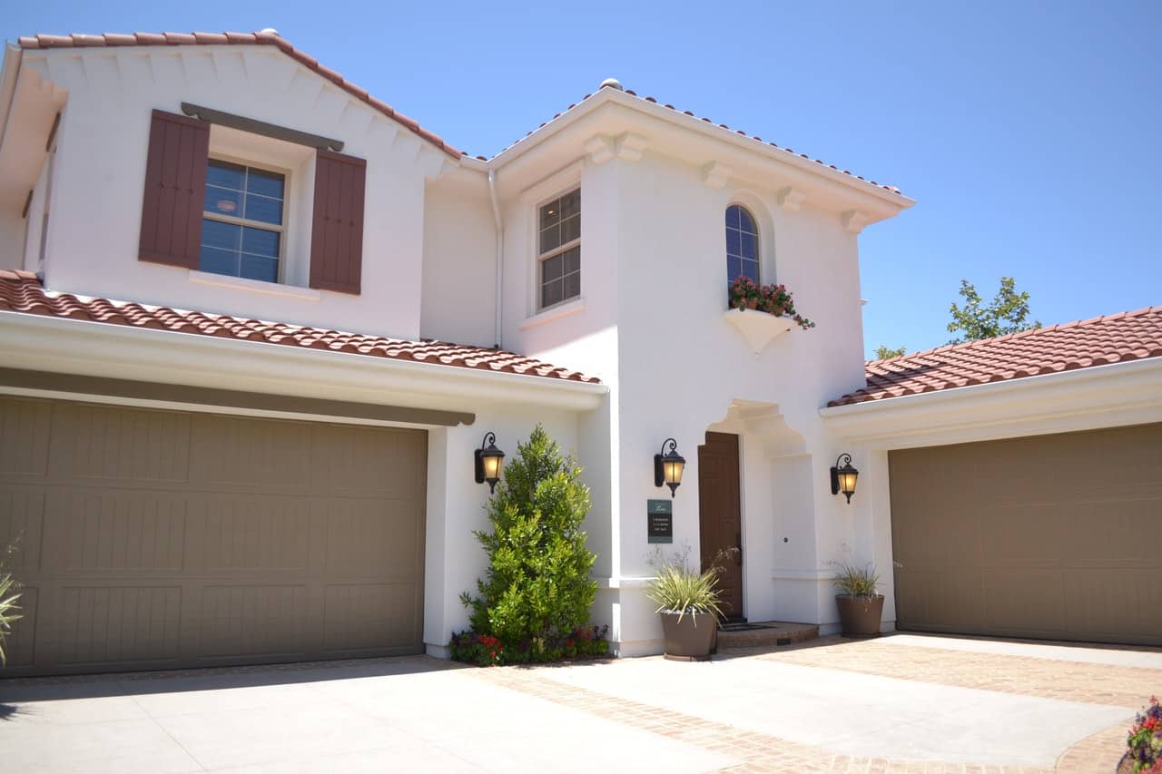
When deciding on a certain color for your facade, you need to take into account the rapidly changing trends and it’s best to go for timeless colors. What is fashionable today will not necessarily work in a few years. In case of modern interiors the best colors will be classic, such as grey, white or beige, which will nicely harmonize with the surrounding nature or other buildings. People who appreciate bold architectural solutions may be tempted by elements in more intense colors, but then you have to be careful not to overdo it with their quantity. It is best if they are a combination of two, maximum three colors.
When choosing a particular color of plaster should also remember that it has a large impact on the proportions of the house. Light facade makes the house seem larger than it really is and perfectly harmonizes with the surroundings. Dark colors, on the other hand, are good if you want to emphasize specific elements of the building.
When choosing plaster, many people suggest visualizations available on the Internet websites, which may differ significantly from the final effect visible on the wall. You can also use pattern books available in stores. Unfortunately, it is worth remembering that on a large surface and in the daylight they may look completely different. Before you finally decide on a particular shade, it is best to use a fragment of one of the walls to test the color.